
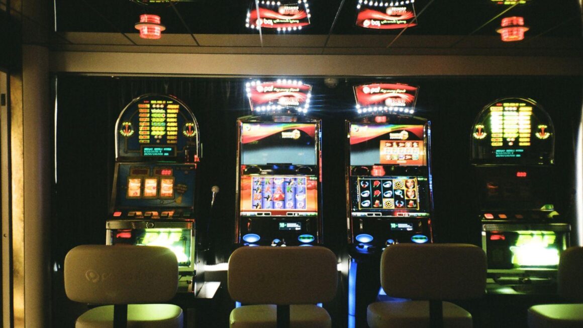
When people browse different kinds of digital games, online slots in Bangladesh provide a clear example of how quickly a visual theme can take shape. There is rarely time for a long introduction. The setting has to make sense almost at once. A background, several symbols, and a short sound cue may be all the game uses to create a place, mood, or story. When those parts match, the theme feels natural. When they do not, even detailed artwork can feel random.
The opening screen has one clear job
The first screen does not need to explain everything. It only needs to point the player in the right direction.
A coastal setting might use boats, bright water, wooden docks, and weathered signs. A fantasy game may show stone towers, glowing objects, and unusual creatures. A city theme could rely on traffic lights, glass buildings, and metal textures. The player understands the basic idea before any feature appears.
That first impression depends on consistency. A tropical background can work well with fruit, sea creatures, or travel objects. It becomes harder to understand when unrelated robots, medieval weapons, and winter symbols appear in the same place.
Designers often get better results by choosing fewer elements. One strong landmark and a small group of related symbols can say more than a screen filled with decoration. The theme feels clearer because nothing appears by accident.
Symbols carry most of the setting
The grid is usually where the story lives. Symbols show who belongs in the game world and what that world is about.
A market theme might include spices, baskets, fabrics, and a merchant. A travel game could use passports, cameras, tickets, and luggage. These objects are simple, but together they suggest a complete setting.
Not every symbol should look equally important. A central character may need a larger frame, stronger contrast, or a more distinct shape. Smaller objects can use simpler designs. When every icon is equally bright and detailed, the screen becomes difficult to scan.
The drawing style also matters. A hand-painted background may feel strange beside glossy 3D symbols. The combination can still work, but it has to look intentional. Shared outlines, colors, and textures help separate design choices feel like one world.
Players should not have to stop and ask why an object is there. Its place in the theme should be clear from the first glance.
Five choices that make a theme feel connected
A game world usually feels coherent because several small decisions support the same idea:
None of these choices needs to be complicated. A quiet background and three repeated objects may create a stronger impression than a large collection of unrelated details.
Variation still helps. A character can return with another expression. A location can appear in daylight and later at night. A repeated object may change slightly during a special scene. The world stays recognizable, but it does not feel frozen.
Extra decoration can make the idea harder to read
Detailed artwork often looks impressive in a screenshot. During play, it can become tiring.
Animated backgrounds, glowing borders, floating particles, and moving symbols all compete for attention. When everything moves, the player may struggle to see what matters first.
A cleaner layout gives the eye a clear order. The main action should be noticed before supporting symbols. Decorative objects should stay behind both. This does not make the game look empty. It makes the design easier to understand.
The same rule applies to characters. One memorable accessory may say more than a costume covered in small details. A location may need one recognizable building rather than dozens of objects placed in every corner.
Strong visual storytelling depends on restraint. The screen should feel active, but not crowded. A theme becomes weaker when decoration starts hiding the idea it was meant to support.
Local references work better when they are subtle
For Bangladeshi players, a familiar atmosphere does not require a literal copy of daily life. A few carefully chosen details can create recognition without making the setting feel forced.
River landscapes, textile patterns, warm festival lights, tropical plants, boats, and regional architectural shapes can all help. They work well when they belong to the larger theme.
A fictional town might use balconies or decorative motifs that feel familiar. A celebration scene can rely on color and light rather than direct imitation. A nature-based game may draw from wetlands or monsoon skies without turning the background into a postcard.
The strongest local references are often quiet. They are part of the setting rather than an announcement about it.
Problems appear when cultural details are added only because they look unusual. Mixing unrelated traditions can make the design feel careless. A few connected references usually create a more believable result.
A theme has to last beyond the first screen
A strong opening is useful, but the theme has to remain consistent after the first minute.
Ordinary play, special scenes, transitions, and repeated animations should still feel as though they belong to the same world. If a game begins with a calm historical setting and later introduces effects from a futuristic arcade title, the original idea loses strength.
Consistency does not mean every scene must look identical. Colors can shift. Characters can change position. A location can become darker or brighter. The design simply needs to keep the same visual language.
This is where many themes either hold together or fall apart. The opening may look polished, yet later screens reveal whether the idea was properly developed.
A coherent game world keeps repeating its central idea in different forms. It does not need long dialogue or a cinematic introduction. Color, shape, movement, and sound are enough when they all point in the same direction.
![[D2] Daily Reset Thread [2021-09-07]](https://meltingtopgames.com/wp-content/uploads/2023/07/Untitled-design-2024-07-10T102422.093-1160x651.png)